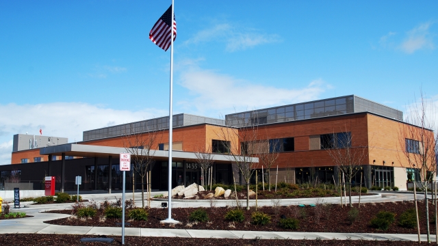
St. Elizabeth Hospital
Enumclaw, WA
2014 MCAA TEAM Awards Winner
Mason Contractor:
J & S Masonry, Inc.
Architect:
Mahlum Architects
General Contractor:
Sellen Construction
Suppliers:
I-XL Masonry Supply
Owner: Catholic Health Initiative
Wall System: Cavity Wall: Brick Veneer/Steel Stud
Project Description
Design Goals: Franciscan Health Systems wanted to modernize and replace the Enumclaw Regional Hospital. The Catholic based non-profit organization turned to Mahlum Architects to create and design that not only reflected the spiritual overtones of the organization, but also worked in concert with the land and city around it. The original Hospital was built in 1949, and this facility was designed to modernize and replace it. Both on the interior and exterior, Mahlum designed the appearance to work with and reflect upon the landscape and scenery around the project. The hospital was also designed to incorporate a number of environment-friendly “green” features: sustainable building materials, non-toxic paint, energy-efficient mechanical and lighting systems, and 100 percent outside air, low flush toilets, and landscaping bioswales to capture and filter rainwater. In addition to providing primary and acute medical care, St. Elizabeth Hospital could serve as a community gathering place in times of windstorms, power outages and other emergencies.
Advantages in using masonry: Brick was chosen for this hospital, as it is for many hospitals, for both the elegance of the appearance and sustainability over time. The more natural appearance of brick provide for soothing, traditional environment, while allowing for a more natural evolution of the building`s exterior over time. The multiple colors allows for the building to use one exterior system for maintenance and evolution while allowing for a more natural and uniform change over time.
Primary details/Features: Two colors of brick were used to create a unique appearance. The bulk of the brick was a Copperstone color, laid in a traditional pattern to reflect the building`s traditional values. The accent brick was laid in a soldier pattern, at significant points around the building, to provide a striking appearance that would draw the eye towards the building`s more significant features.
Unique Use/Special Circumstances: The new project was built in three phases, with the removal of existing buildings to make way for the new construction. The working hospital was then moved to the new facility, all without interruption of service. Once complete, this paved the way for the demolition of the old building so that additional parking could be provided.
Date of Project Completion: October 2010
Photography by Tonia Sorrell-Neal


