AT&T Executive Education and Conference Center
Austin, TX
Mason Contractor:
P and S Masonry, Inc.
Architect:
Lake Flato; HKS, Inc.
General Contractor:
Austin Commercial, LP
Suppliers:
Elgin-Butler Brick Co. ; Acme Brick Company
; San Jacinto Materials ; Fritchman & Associates ; Hohmann and Barnard, Inc.
; TXI ; Tim Weirauch Masonry
Owner: University of Texas
Project Description
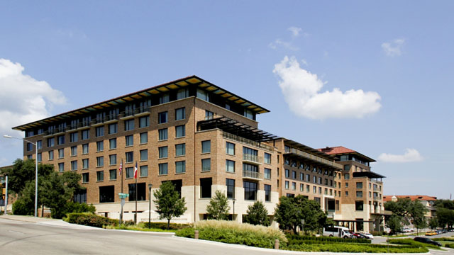
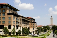
The AT&T Executive Educational Conference Center completed September 2008 acts as the southern Gateway to the University of Texas in Austin. The center has two primary functions; it provides a state of the art learning and conference center and the other to provide a place of lodging for the campus and center. While being a state of the art in function, it also is the first building on campus to obtain a LEED gold rating/certificate.
Like the building being for two primary functions it is composed of two primary materials, brick and stone. The primary brick blend is the standard University brick blend provided by Elgin-Butler (Acme), and the primary stone is a Cordova Cream. While keeping sustainability in mind, the building is clad in locally provided masonry materials, also creating maximum durability.
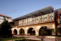
On the west facade the building faces the two busiest streets on campus, and on the east it addresses the tower and the major entrance to campus. The masonry is used as the architect's primary means of expression to articulate these differences in the site's needs. The western facade is for the Conference Center, which creates an arcaded porch clad in a book-matched veneer cut limestone. The booking matching occurs throughout every arch in both the saw marks, as well as the grain in the stone. Because of the tendencies of the soft stone to chip, extreme care had to be taken during installation to insure the entire arch would not have to be replaced. The light colored porch creates a cool relief from the hot western sun, as well as an elegant entrance for the building. It also provides an opportunity for limestone benches to be nestled along the wall.
On the opposite side of the building, there is the hotel which is clad in the brick blend on a base of smooth cut limestone. The hotel side of the center is heavily articulated to break the scale of the needed size and connect more fluidly with the rest of campus. Within these two sides is a courtyard which blends the two funcitons seamlessly. The courtyard uses both the book-matched arches as well as the more linear lintel approach seen in the hotel side. The courtyard had diffuculties of access. Because it is actually elevated and isolated, there were severe limitations on equipment.
The beauty of the building lies in the subtleties of how materials meet each other. The building uses portions of a darker brick blend to indicate divisions within the building's function. In the same fashion, a single panel of Carmel Limestone is used to separate the conference center from the hotel as well as looking directly to downtown. How the stone meets the brick gives the major expressions. Whether it is the traditional base of limestone with brick rising above, or various slight copings, and sills, they each speak to the ability of a sustainable and durable material (masonry) to connect the tradition of masonry on campus with a modern approach to architecture.
Date of Project Completion: September 2008
Awards
2009 CTMCA Honorable Mention; 2010 CTMCA Honorable Mention
Photography by Alexander Odom


